Chapter Eleven
The Multiplier
 The following "algebraic statement of the multiplier" displays the concept
of a linear flow of wealth from production to consumption.
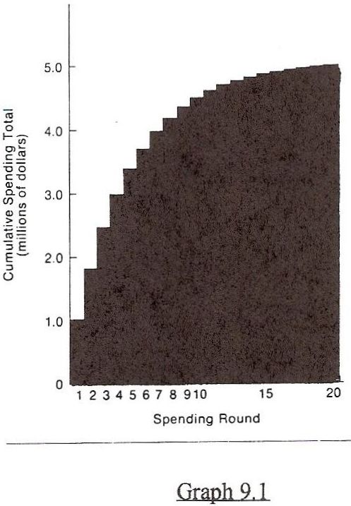
Graph 9.1
The image abve depicts "the dollar multiplier" taken from "Economics, Principles and Policy," Second Edition, written by William J. Baumol and Alan S. Blinder of Princeton University during the 1980s.
This multiplier effect of raw materials income in the creation of annual national income is the fundamental feature of Raw Materials Economics.
The vertical series of numbers on the left of the multiplier image represent the multiplication of income, from $1.00 to $5.00 as raw materials are converted by labor into finished goods.
The distance between 0 to 1, according to Raw Materials Economics, is raw material income itself, or raw material income plus debt expansion, which, according to the textbook, rolls over at an infinite progression of .8, leaving a residual profit of 20%, or the 1 in the 1 to 5 ratio.
The Princeton textbook teaches that accumulated rollovers will total approximately four turns rather quickly (in 12 to 14 months). By applying the principles of Raw Materials Economics, a rollover 4.17 can be calculated during this period.
Note: In 1994, President Clinton appointed co-author Alan S. Blinder to the Federal Reserve Board.
THE RATIOS ARE THE MULTIPLIERS
The ratios explained in Raw Materials Economics are in fact, the multipliers. Data from seven income groups offer evidence. This data demonstrates a steadily increasing flow of raw materials energy through the economy. This growth is predictable and manifests as expanding ratios.
The data from seven income groups describes annual raw materials energy as a ratio to National Income.
The forthcoming charts demonstrate that:
·1. Annual Gross Savings
·2. The annual amount of consumer income available for expansion
·3. The Available Capital Pool
·4. The Gross Private Domestic Investment
·5. Total Corporate Business Trade Credit
·6. Total Checkable Deposits
·7. The total Profits of Private Enterprise
flow through the economy at a ratio to National Income almost identical to the ratio of parity priced annual raw material income to actual National Income which is a ratio of approximately 1 to 5.
The columns of statistics on Table 74 were developed from government records and demonstrate almost identical average ratios to National Income. The reason is simple. All these ratios express the same value that's in motion through different stages of product development. These ratios represent the same level of energy in the economic pipeline, either metabolic or kinetic, that's in a continuous linear flow to consumption and entropy.
In Chapter 4, the ratio of Gross Savings to National Income was examined, but not explained, because a brief explanation is impossible. It should now be obvious that the first part of the 1 to 5 ratio is the parity value of raw materials at the first point of sale, or the combined total of underpriced raw materials plus annual debt expansion.
Raw materials energy finds its way through the economy in many forms. One of these forms is Gross Savings. Therefore, Gross Savings will always approximate parity raw materials income. Gross Savings is actually the same money, or value as parity raw material income at a different time and place. This same 1 to 1 relationship exists between actual raw material income plus debt expansion and the other six income components listed on Page 2 of this chapter.
Currently, the anemic profitability of the private enterprise system forces underpriced raw materials income to be combined with debt in order to create savings and the other listed totals. This debt passes through the production system and remains as debt expansion.
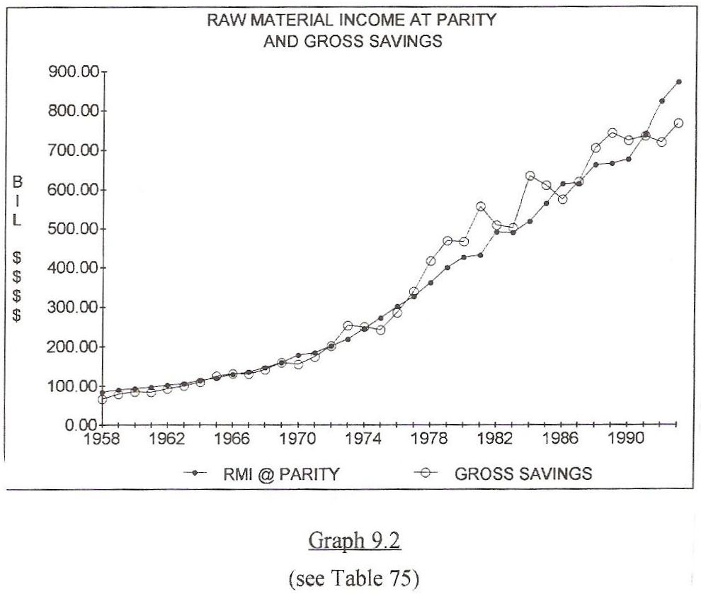
PARITY RAW MATERIALS INCOME EQUALS GROSS SAVINGS
Graph 9.2 illustrates that a society's metabolic and kinetic energy manifests as gross savings.
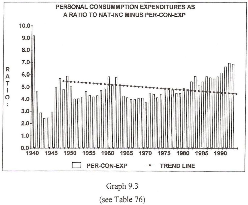
RAW MATERIALS INCOME AND PERSONAL CONSUMPTION EXPENDITURES
Graph 9.3
Graph 9.3 offers more evidence of consistent 1 to 5 ratios that express a linear flow of wealth (energy) through the economy.
This graph represents expenditures for living expenses and maintenance. Since WWII, these expenses have averaged about 80% of National Income. They include; food, toiletries, rent, gasoline, electricity, telephone, water, etc., basically everything except long term purchases.
The remaining 20% is spent on cars, houses or used in ways that commit citizens to long term purchases. This remaining money is another parking place for the paper equivalent of raw material income at parity, which in today's economy is actually raw material income plus debt expansion.
Graph 9.3 should be viewed from two perspectives. First, the average money available for long term purchases from 1946 through 1992 averaged about 20% of National Income or the number (1) in the 1 to 5 ratio. In recent years, the ability of consumers to make long term purchases, even with debt expansion, has reached a post great depression low of approximately 12% of National Income. Current state of the arts demand that this percentage be no less than 13.73% on a debt free basis.
The arithmetic is as follows: 100% of National Income divided by the Raw Material multiplier of 7.28 equals 13.73.
This graph reflects the low prices paid for raw materials. It demonstrates that undervalued raw materials create a high cost, low profit economy.
Currently, the difference between National Income and Personal Consumption Expenditures (the long term average of 15% to 20%) represents the profits synthesized from the debt used to re-generate the economy. Regardless, it is a monetary representation of raw materials in flow.
Today, the sum of the difference between National Income and Personal Consumption Expenditures can be expressed as a ratio to National Income at approximately 1 to 5. Specifically, the difference between National Income and total consumer expenditures in 1991 was 708.2 Billion Dollars, which approximated raw material income at parity in 1991 which totaled 736.9 Billion Dollars. This is a very clear example of how raw material energy flows through the economy and determines profits.
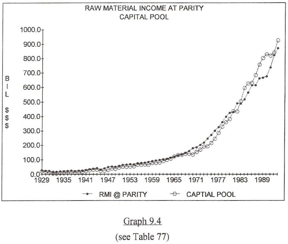
PARITY RAW MATERIALS INCOME EQUALS THE CAPITAL POOL
Graph 9.4
Graph 9.4 compares the total amount of liquid assets available at any given time to their energy representation as raw materials. The amount of raw materials (in flow) equals the amount of net energy (in flow), so raw material energy has a cash equivalent.
The Capital Pool is the combined total of corporate dividends, rental income and net interest. The capital pool is available liquidity that reflects parity raw material value.
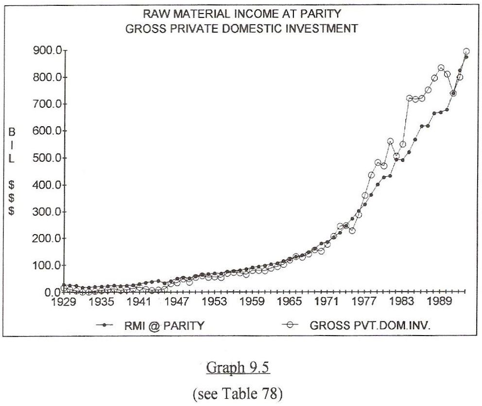
PARITY RAW MATERIALS INCOME EQUALS GROSS PRIVATE DOMESTIC INVESTMENT
Graph 9.5
Graph 9.5 compares gross private domestic investment to an energy equivalent as raw materials. As shown, debt expansion attempted to violate the correlation at numerous occasions in the 1970's and 1980's. This is obvious from the two large upward spikes in private investments during the most recent decades. Inevitably, the economy returned to a normal level of energy parity dictated by raw material flow and state of the art technology.
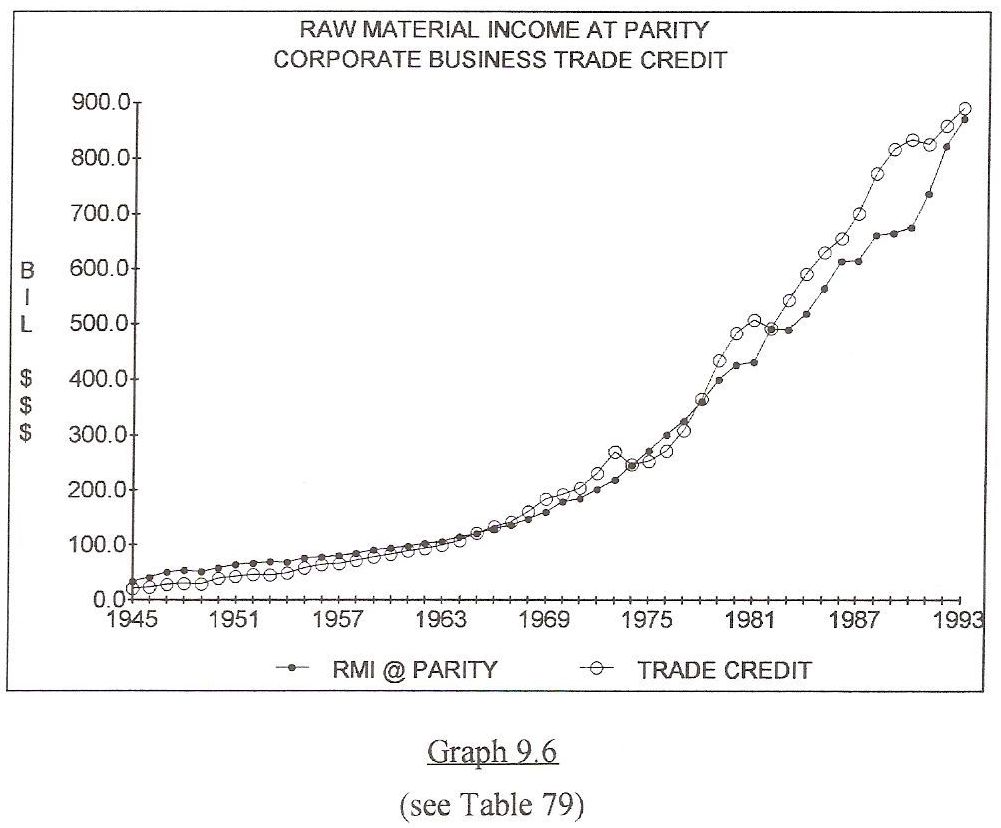
PARITY RAW MATERIALS INCOME EQUALS CORPORATE BUSINESS TRADE CREDIT
Graph 9.6
Graph 9.6 compares total corporate business trade credit to raw material income at parity. For 50 years, the energy of raw materials has been the governing factor over trade credit.
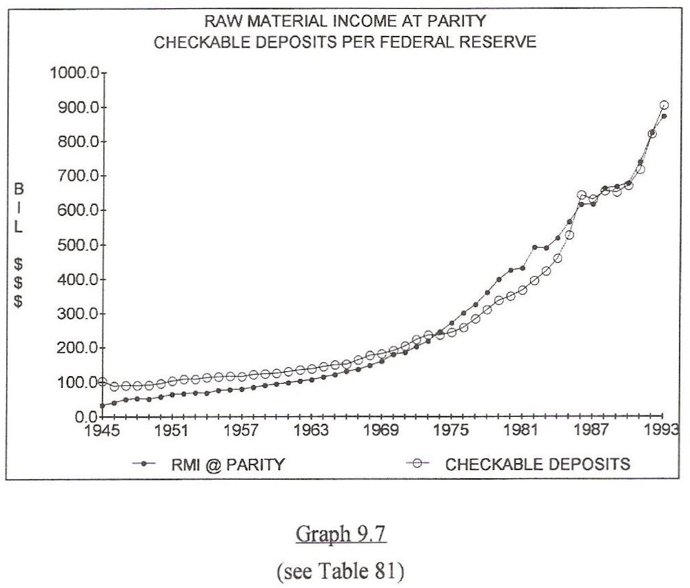
PARITY RAW MATERIALS INCOME EQUALS TOTAL CHECKABLE DEPOSITS
Graph 9.7
Graph 9.7 compares checkable deposits to raw material at parity since 1945. Checkable deposits should be greater than raw material at parity so un-encumbered money can facilitate the movement of raw materials through the production system. As the economy fell deeper into debt, checkable deposits fell to a level that dictates continuous borrowing so wealth can move through the economy.
The energy based similarity of all these ratios is further supported by adding actual raw material income to public and private debt expansion.
In 1992 these two items (raw material income plus public and private debt expansion) totaled 867.44 Billion Dollars, and thus created the new money in the capital pool, which at the end of 1992, totaled 801 Billion Dollars. More importantly, since 1910 the difference between raw materials income at parity and actual raw materials income plus net debt expansion is only 1.1%. Remember, the annual production and consumption of energy must be acknowledged in dollar form, either by debt, or by earnings, or by some combination of the two. (is 1.1% right)
Since 1958, raw material wealth has flowed through the economy at the following average ratios to National Income:
Capital Pool.......................................................................1-to-5.5
Actual Raw Material Income plus Gross Debt Expansion.......1-to-5.3
Checkable Deposits............................................................1-to-5.1
Personal Consumption Exp. subtracted from Nat'l Income.....1-to-4.9
Gross Savings....................................................................1-to-5.2
Gross Private Domestic Investment.....................................1-to-5.1
Profits of Private Enterprise................................................1-to-5.0
These parallel ratios are nothing magical. They are simply the dollar reflection of flowing energy.
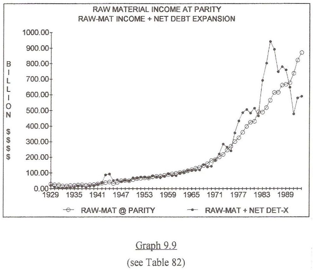
USE PARITY RAW MATERIALS INCOME OR ADD DEBT CREATE PROFITS
Raw materials income at parity values, or underpriced raw material income plus net debt expansion, eventually manifests as the profits of private enterprise. This profit can be a product of value, or it can be synthesized from debt expansion.
Graph 9.9
Graph 9.9 illustrates this mechanism. Since 1966, accumulated raw materials income at parity totaled 12,464 Billion Dollars, or an amount within 8.38% of being equal to raw materials income plus net debt expansion, which totaled 13,604 Billion Dollars for those years. The 8.38% difference represents the inefficiency of debt as a generator of National Income.
During that same period, the profits of private enterprise totaled 12,656 Billion Dollars, or an amount within 1.5% of raw material income at parity. This exercise proves that if raw materials are properly priced, they become the origin of all profits and the source of all savings. This establishes a bond between physics and economics because the energy within raw materials (both metabolic and kinetic) is the value that American business and labor exchange and accumulate.
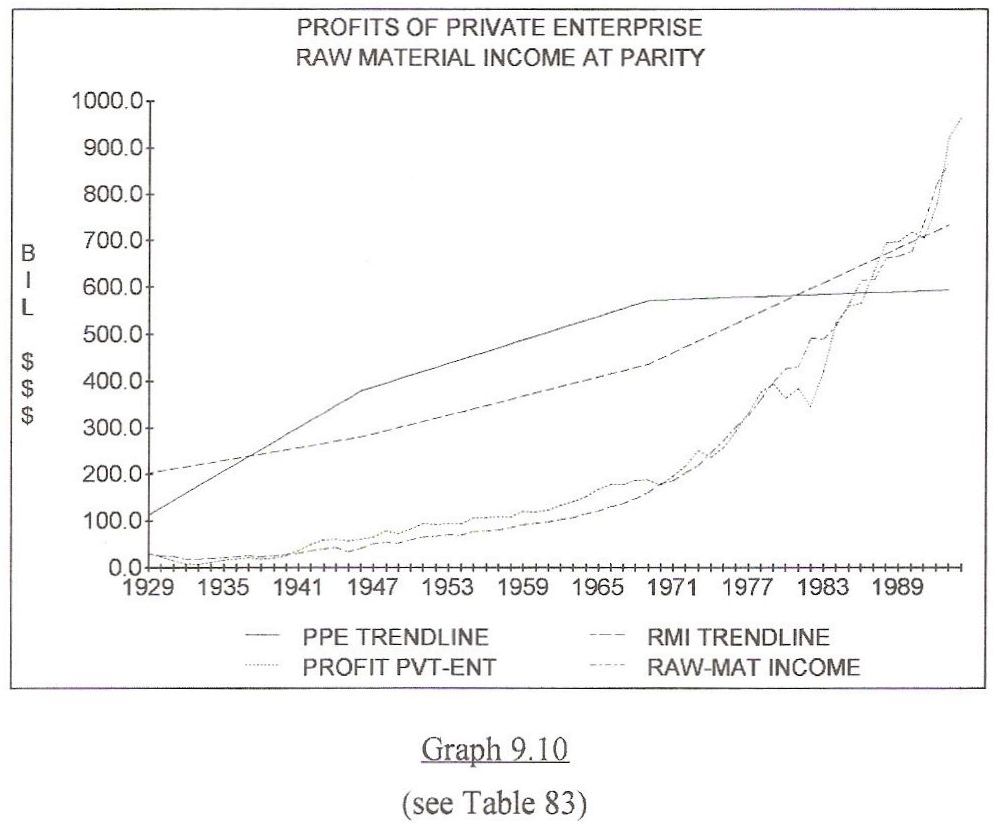
Graph 9.10
Graph 9.10 compares two income streams in two ways. One of these income streams is hypothetical; Raw Materials at Parity in current dollars. The other income stream is the sum of all Profits of Private Enterprise in current dollars taken from government records.
The straight trend lines are shown in constant 1987 dollars. This Graph spans the great depression and several wars, and is very instructive with regard to the floor that raw materials install within a private enterprise system. As you can see, Raw Materials Income at Parity and the profits of private enterprise increase at the same angle. However, the Profits of Private Enterprise fluctuate wildly.
This Graph speaks volumes about the structure of a private enterprise economy. Please track the two lines and consider the variations between raw materials income and profits through the years.
If actual raw materials income (and prices) are low, as was the case during the great depression, the profits of private enterprise temporarily fall to the natural floor of raw materials income at parity. When raw materials prices rise closer to their intrinsic value, the profits of private enterprise increase above this floor and maintain a higher (taxable) level until the economy again becomes submerged under debt.
The American government enjoyed its most recent balanced budget in 1969. That was the most recent year Americans produced enough profit to afford a balanced budget.
Raw materials income at parity, is the natural floor under the profits of private enterprise but it is not the cap over profits. The cap is actually a ratio of two parts cost to one part profit that can only be maintained if actual raw materials prices are maintained at parity levels.
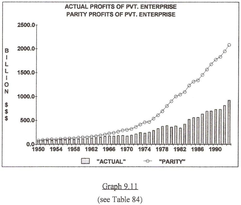
ACTUAL PROFITS COMPARED TO THE PROFITS OF A PAR ECONOMY
Graph 9.11
The top line on Graph 9.11, reflects the appropriate level of profits necessary to prevent un-necessary debt expansion. This level of profit can only occur if raw materials are priced to flow through the economy without a debt subsidy. The lower set of values is the actual profit that occurred after the economy was subsidized by debt expansion. The difference between these two lines is over $14.7 Trillion Dollars. This is lost profit. This difference can pay all of America's public and private debt and leave about $1 Trillion extra in the banks!
Now, an important mathematical loop. The lost profits of private enterprise were caused by two opposing factors that increased costs and reduced profits. First, farm income, which represents 2/3 of all raw materials income dropped from 7% of National Income to under 1% since the 1947-49 base period. At the same time, net interest income rose from just over 1% of National Income to between 8 & 9 % of National Income since the 1947-49 base period. This flip flop of income from the left side to the right side of the T-chart produced most of the debt which is depicted as a loss of profits on Graph 9.11.
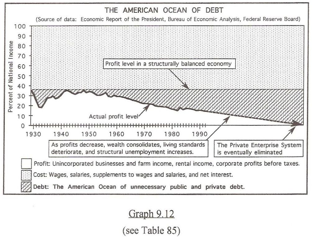
THE AMERICAN OCEAN OF DEBT IS GETTING DEEPER EVERY YEAR
Graph 9.12
Graph 9.12 is another illustration of this phenomenon. This Graph uses the bottom half of Graph 5.10 to display the falling profits of private enterprise. It contains a straight line at the point that coincides with 1/3 of National Income or, the level of profit necessary to prevent debt expansion. The shaded area below this straight line totals 14.7 Trillion Dollars, or the total public and private debt. Therefore, lost profits, when accumulated, equal gross debt.